 There’s an old adage… you can’t judge a book by its cover, meaning (according to the Brittanica Dictionary) “that you shouldn’t judge someone or something based only on what you see on the outside or only on what you perceive without knowing the full situation.” It’s a good reminder to try not to make snap judgments about people and situations.
However, when it comes to actual reading materials, I think many of us fall into the trap of judging books by their covers.
Let’s face it: So many books, so little time. If I’m in a bookstore with the goal of choosing just one book (even if I might want to buy 20) the cover–as well as the title–WILL play a huge role in my decision, especially if the author is unknown to me, or the book hasn’t been specifically recommended. And I don’t even consider myself a visual person, so I think this may be even more true for others.
That’s why the cover of a book is so important.
My first two books were published by major houses, which meant I had very little say over their covers–or titles, both of which were changed from my originals. I could suggest tweaks but I had no say over the whole concept. I was lucky to love the cover for my first book, Escaping Into the Night,  but I never liked the cover for my second book, Playing Dad’s Song.
  It wasn’t much consolation that the book with the cover I liked did way better than the book with the cover I didn’t like. I couldn’t help but wonder and wish that a stronger cover would have made a difference with this book’s performance in the market.
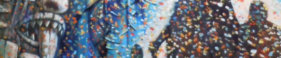
My third book, Wolf in the Suitcase, was a poetry chapbook published by a small press, and I had a lot of say in the cover design. I chose a painting by my late father-in-law, Michihiro Yoshida, in part to honor him post-mortem. 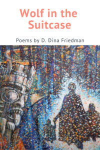 Since poetry is tough to sell to people who don’t know you, I didn’t really think too much about market impacts, though I hoped the bright and engaging colors would evoke interest.
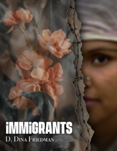
And this brings me to my current short-story collection, Immigrants, coming soon! When the publisher, Creators Press, first asked me for my ideas, I sent a couple of photos I’d taken on my trip to the U.S./Mexico border, but they thought these images were too blatant, especially since most of the stories weren’t about the border. After their team generated a list of different ideas, we followed up on two possibilities: a person at a crossroads, and a half-hidden face. When the designer worked up both images, it was clear to me that the face was the winner.
Still, there were several more iterations. The first face looked too white, the second too young and romantic. In a subsequent draft, the tear in the curtain looked too ill-defined, so the designer came up with the idea of adding barbed wire. This certainly raised the clarity and emotional temperature; however, I was worried about the implied violence in the image, since the emphasis of the book is more about human connections than about politics. So I asked the designer for one draft with the barbed wire and one without, and then asked around 15 people–writers, artists, and activists–to comment on which one they liked better.


While the majority of those I asked seemed to think the barbed wire image was more powerful, those who didn’t like it, felt strongly (as I did) that the implied violence was a turn-off. But one of the people I asked, got her artistic juices flowing. After printing and cutting up different pieces of the image, she came up with a hybrid of the two that had pleats and just a hint of barbed wire, which the designer took as a model for the final draft. While I was a bit worried about being so picky and taking so long, I was happy that the designer (instead of thinking I was a pain in the butt) thanked me and said, “I feel like this has been a very rewarding process so far, and I’m really excited about the final product we can achieve!”

So, there we have it. Who knows what impact the cover will have on the book’s success, but I hope that if Immigrants is judged by its cover, it will be judged favorably.
To subscribe to this blog, sign up at ddinafriedman.substack.com
 It’s one of the stories in my forthcoming collection, Immigrants (Creators Press, Fall 2023).